Project Brief
Comic-Con Website Redesign (Solo NAIT project | December 2025)
Objective: Using Figma to redesign an event site for better navigation and improve user experience.
What I learnt: From this project, I learnt how to connect user research to design decisions.
Personas
Key Insights: Users need quick access to schedules, ticket and maps to make travel plan, get real-time updates and events' information.
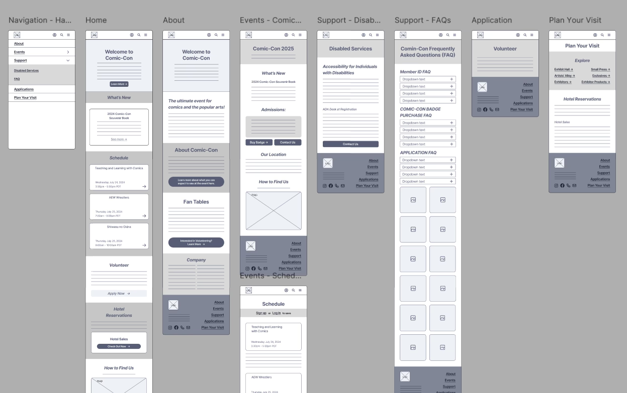
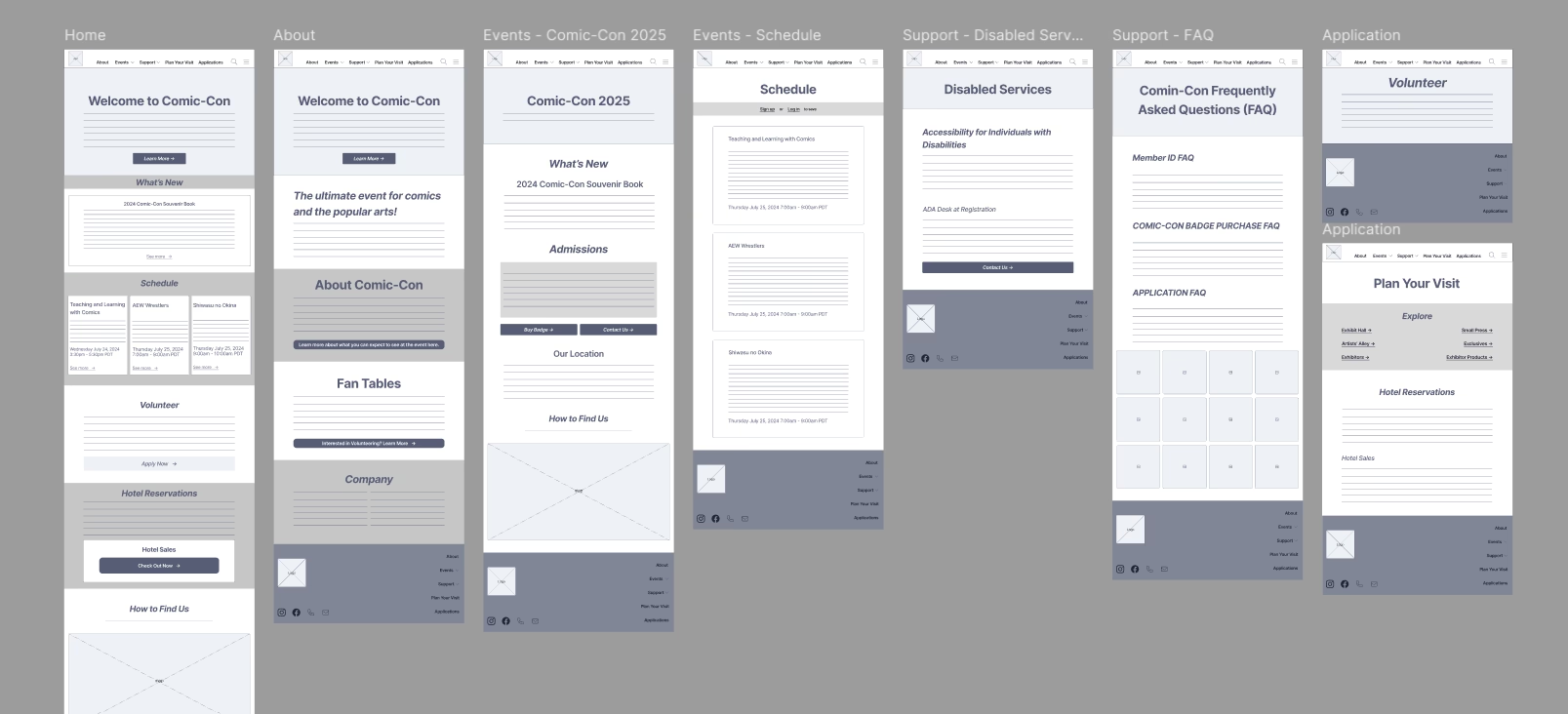
Low-fidelity Wireframes
My initial idea was to create a navigation bar with drop-down elements, short content pages so users can scan through information quickly and navigate through the pages faster. Contents were arranged to fit the navigation categories, and make sure users can find what they need. These are my low-fidelity wireframes for mobile and desktop devices.
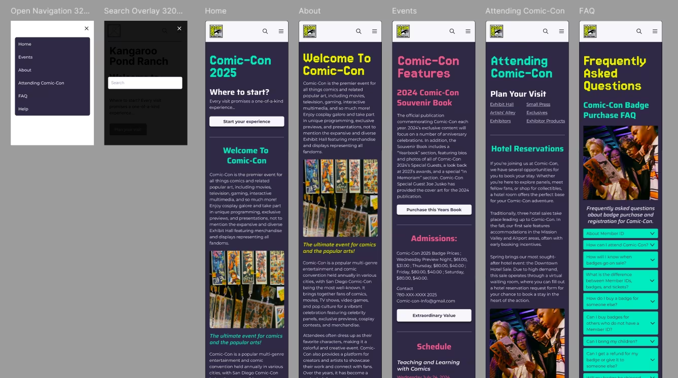
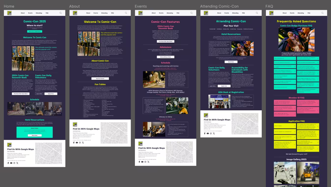
Final Design
Later on, the initial idea was changed to make the navigation items less confusing for the users, and make the final design process less time-consuming. Contents were rearranged into long pages and images were taken from Unsplash to ensure the design works properly. I decided to choose a vibrant color palette but similar to that of Comic-Con original website to keep that familiarity feeling for returning users, headings have different colors for different pages to freshen visual design as well as to improve readability.